OBJECTIVE
Use photography to communicate a concept using a style of music and album title as subject. Make photography work in harmony with the title to establish the feeling and attitude of the record in a captivating way. Gain experience combining typography with photography, layout design, and packaging at different scales.
SKETCHES

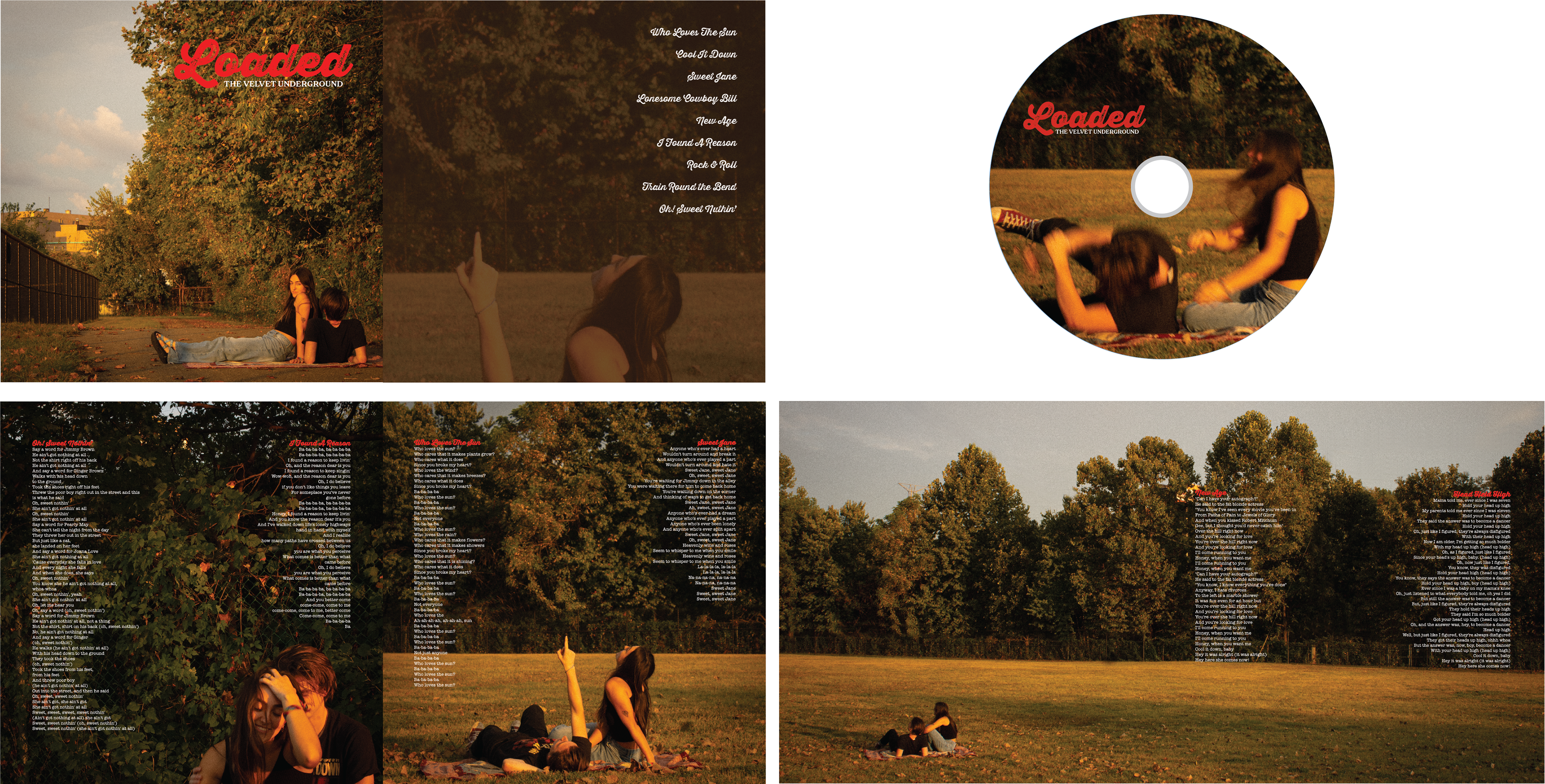
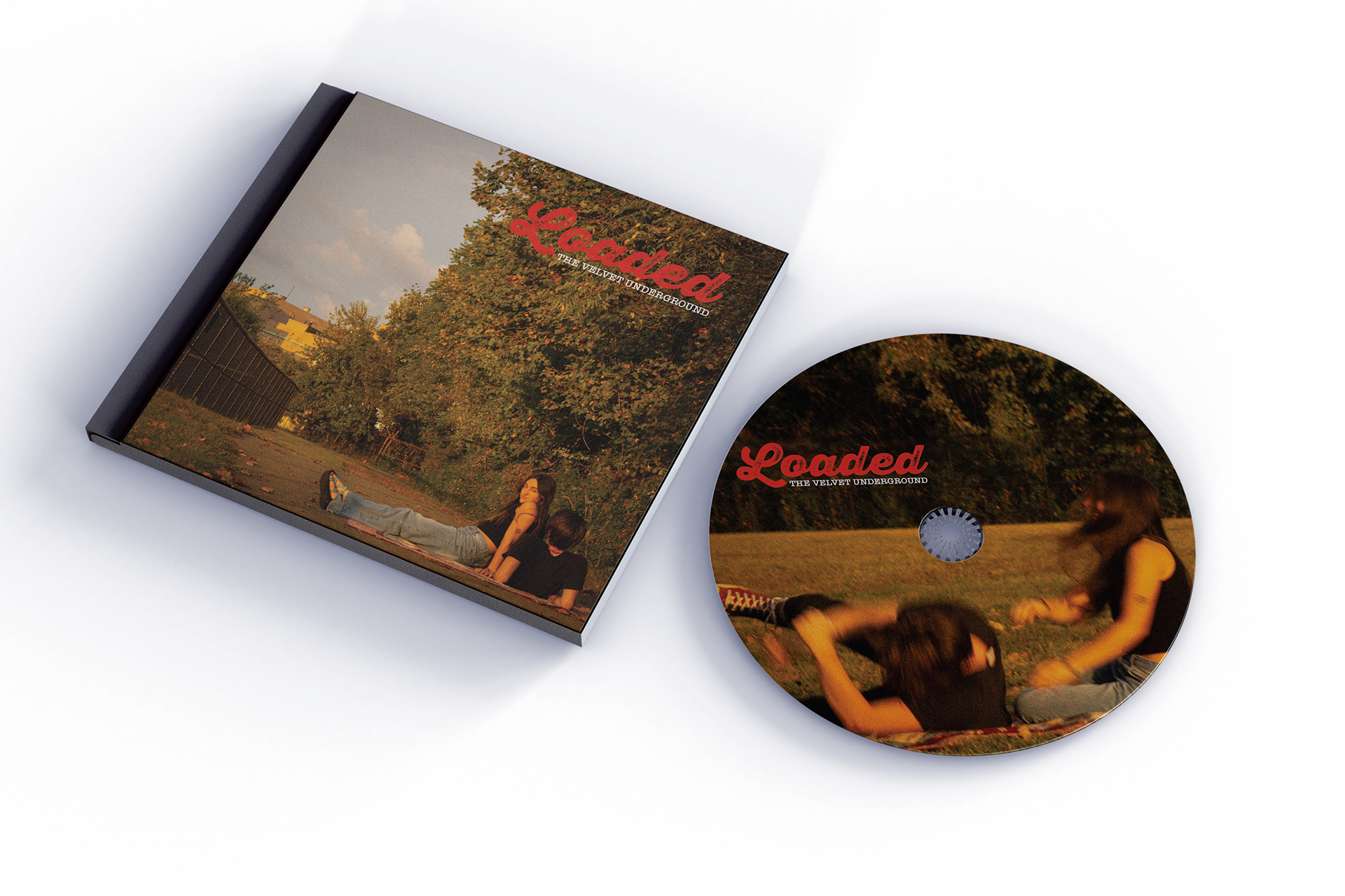
Loaded by The Velvet Underground is a 70s rock album that has acoustic, upbeat, and groovy instrumentals. However, the lyrics delve into the unglamorous side of romantic relationships and existential themes of life. Interest is created in the juxtaposition of the contrasted instrumentals and lyrics.
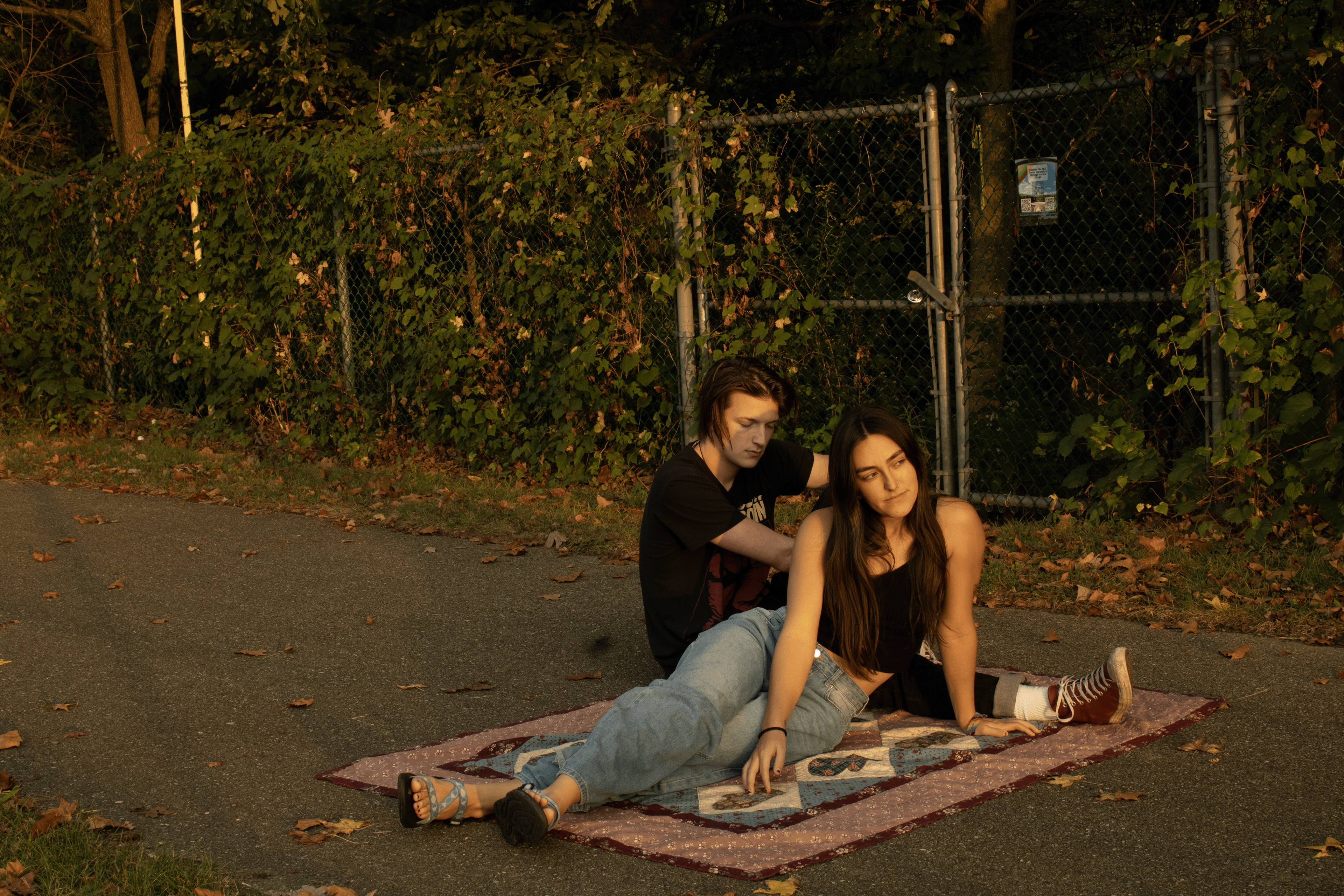
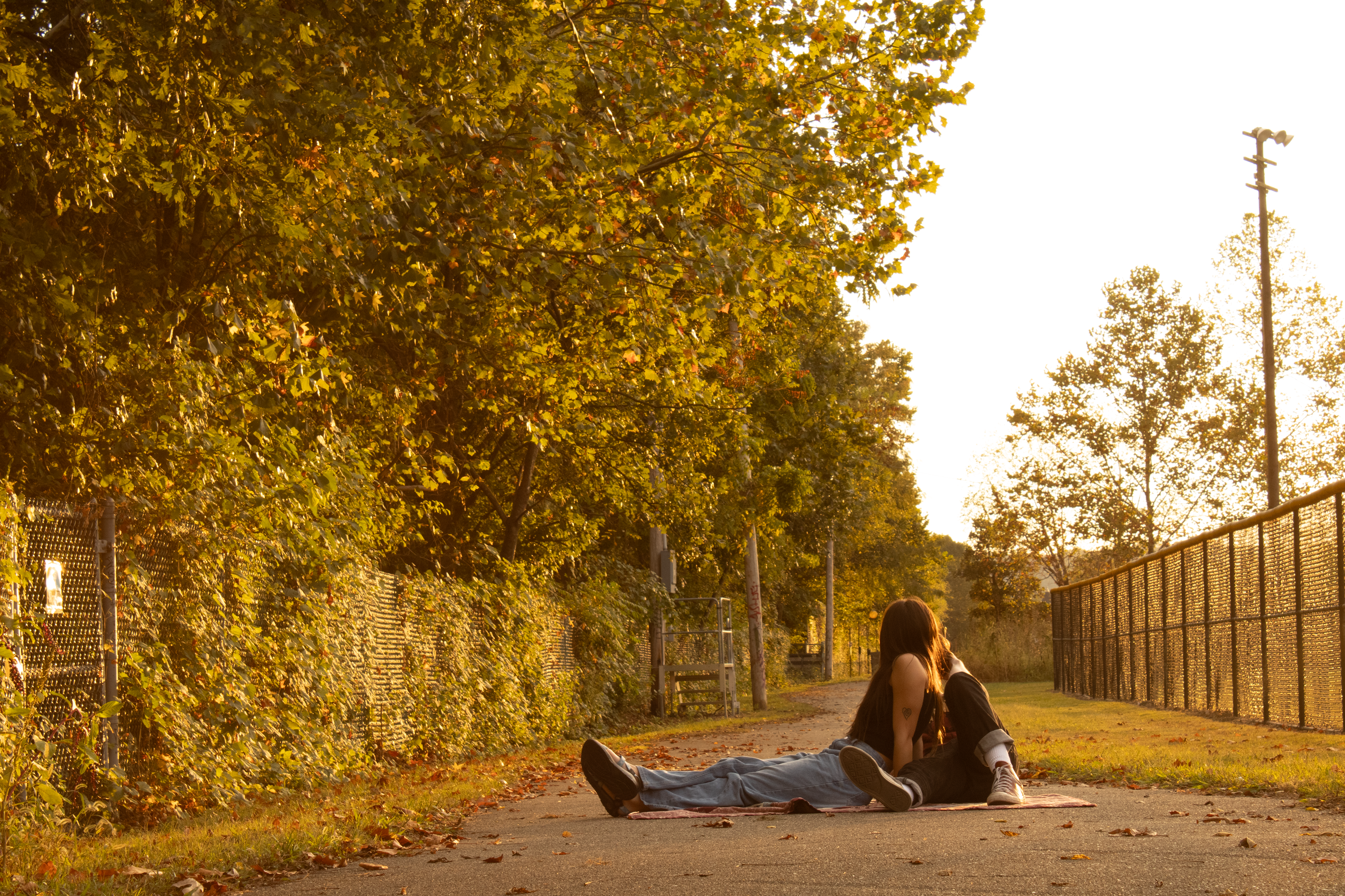
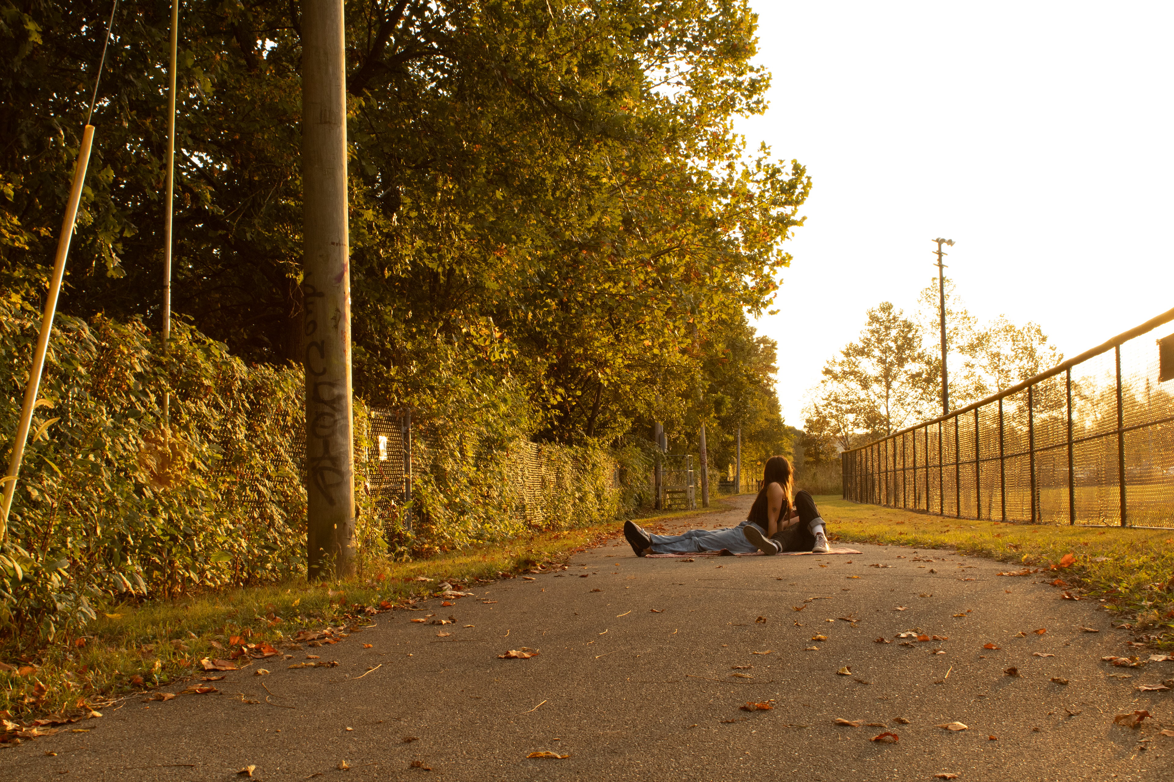
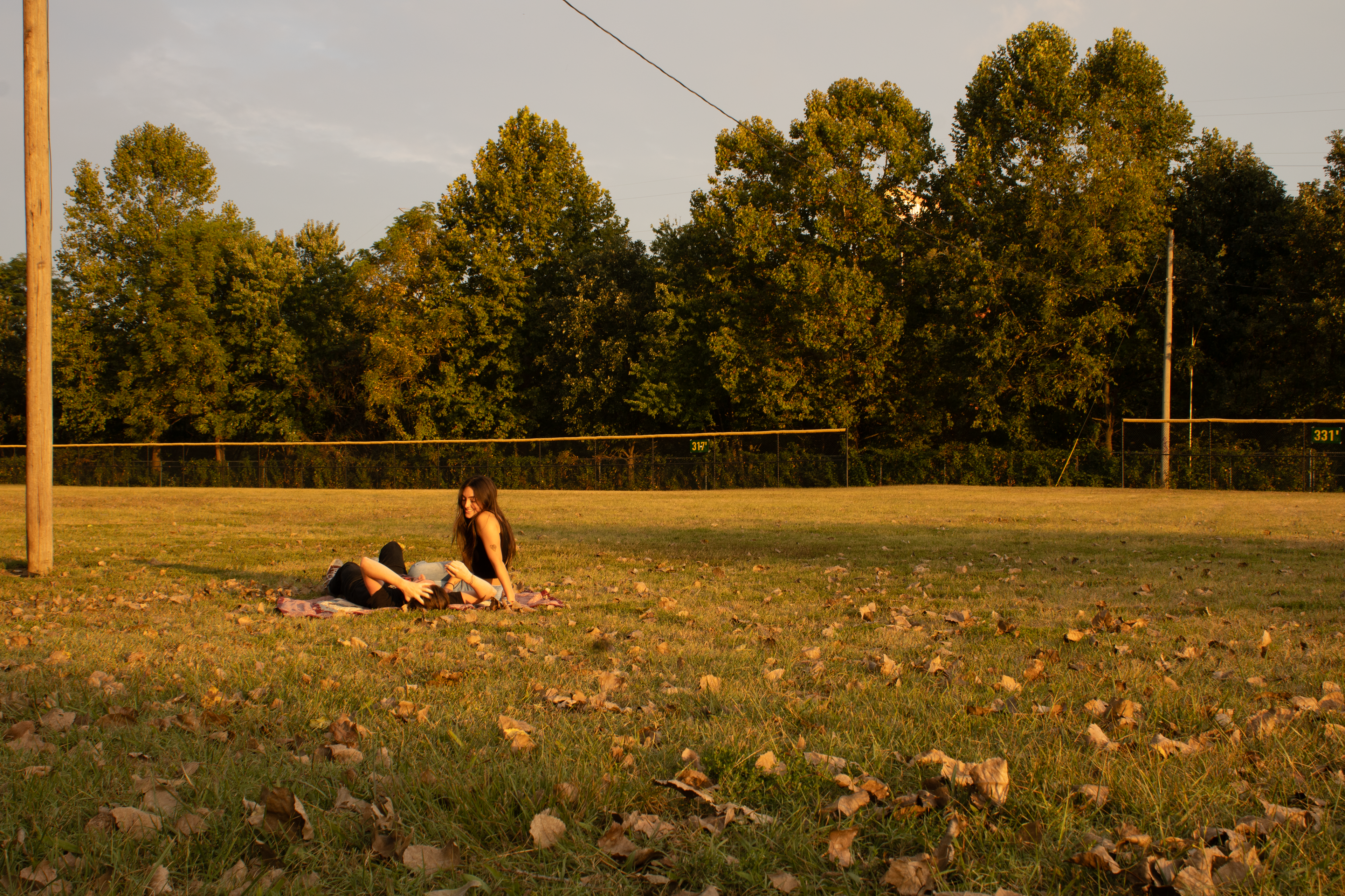
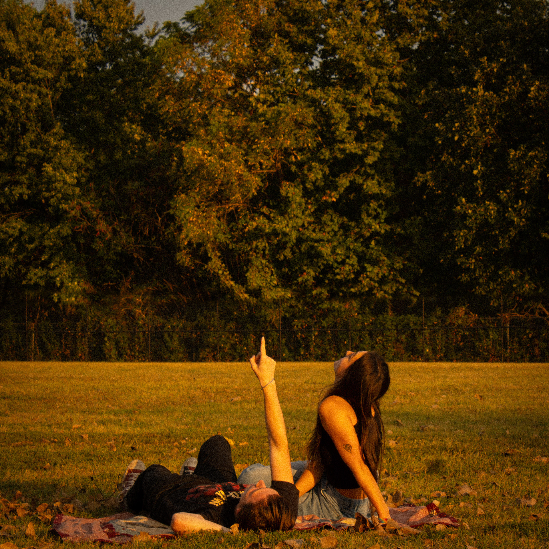
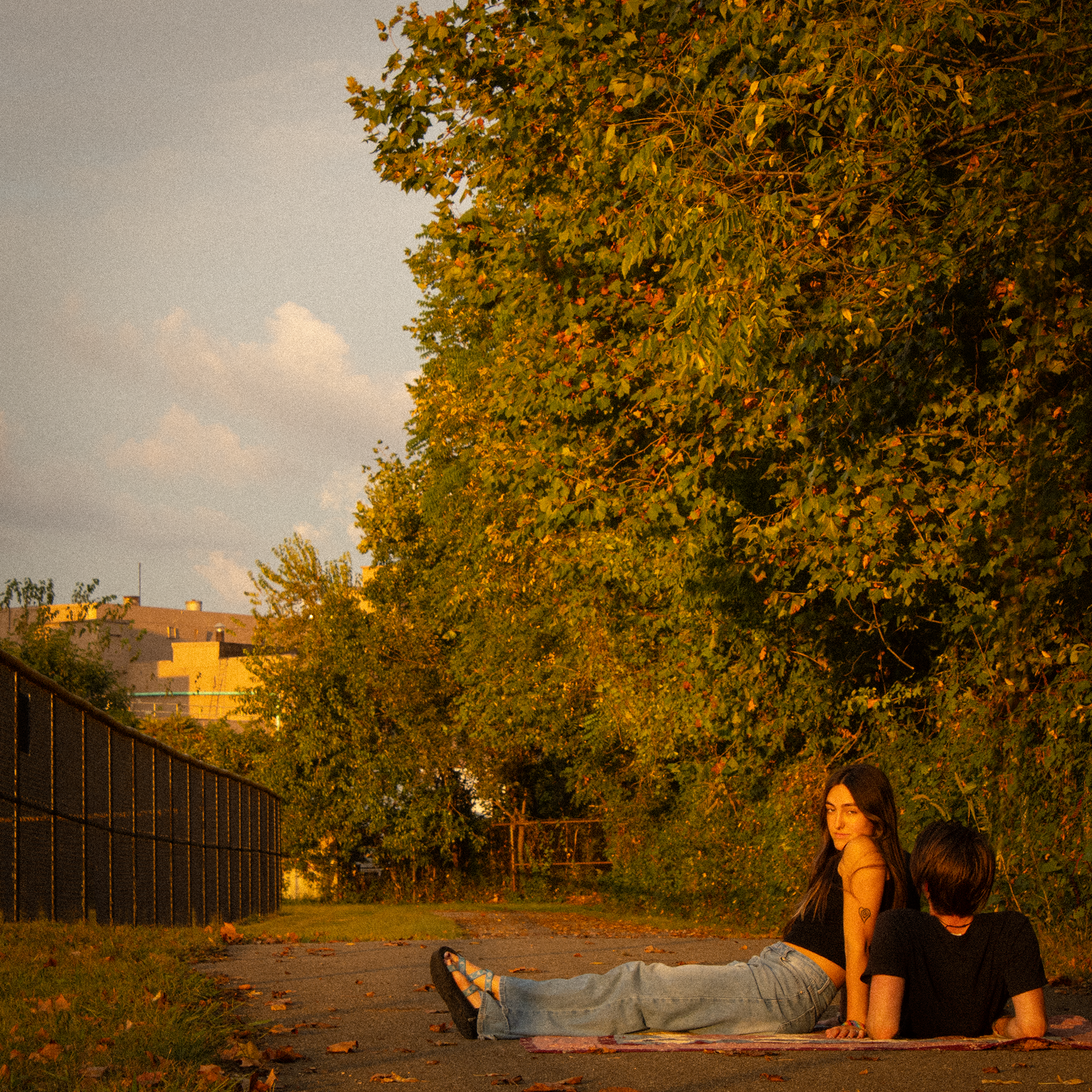
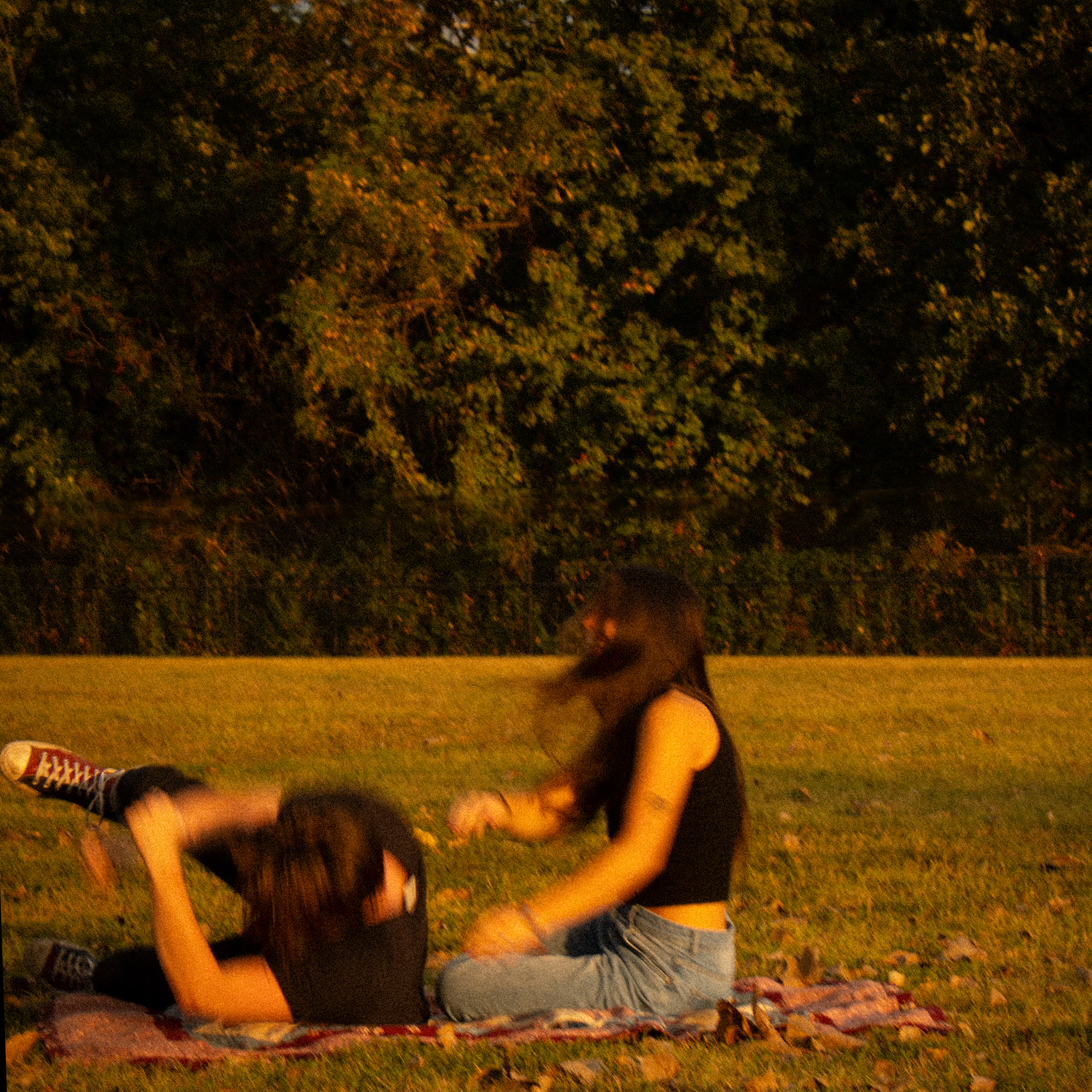
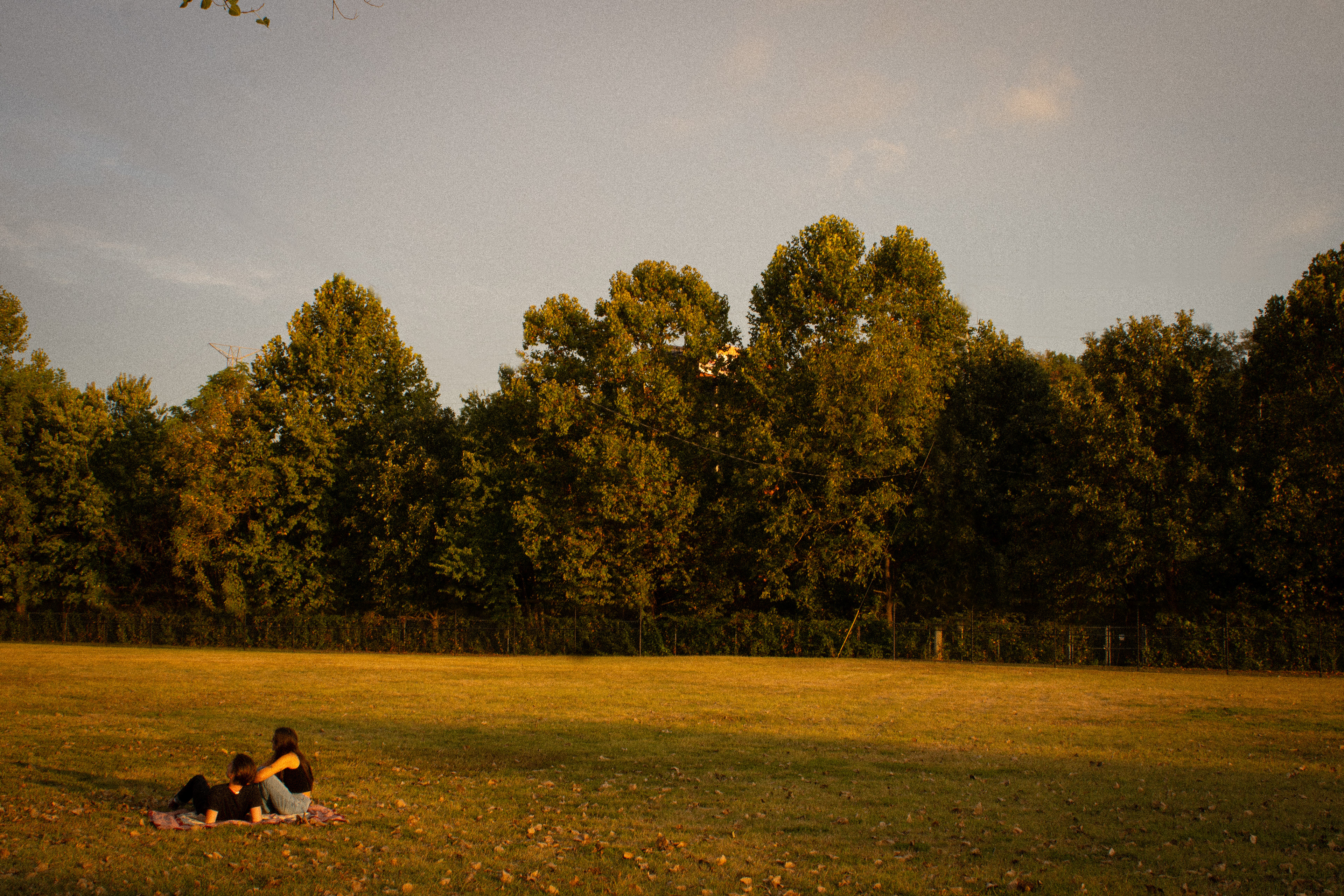
To communicate both the upbeat instrumentals and the themes of unglamorous yet realistic romantic relationships, I planned to photograph a couple outside at golden hour in a beautiful green space. I intended to create an unsettling factor with a couple picnicking in the middle of the road or walking on train tracks. To communicate the authenticity and romance of the album, I planned to make the temperature of the photos warm, add grain to make it feel film-shot, and turned down highlights. Above are potential compositional ideas.
PHOTOGRAPHY EXPLORATION

TYPOGRAPHY EXPLORATION
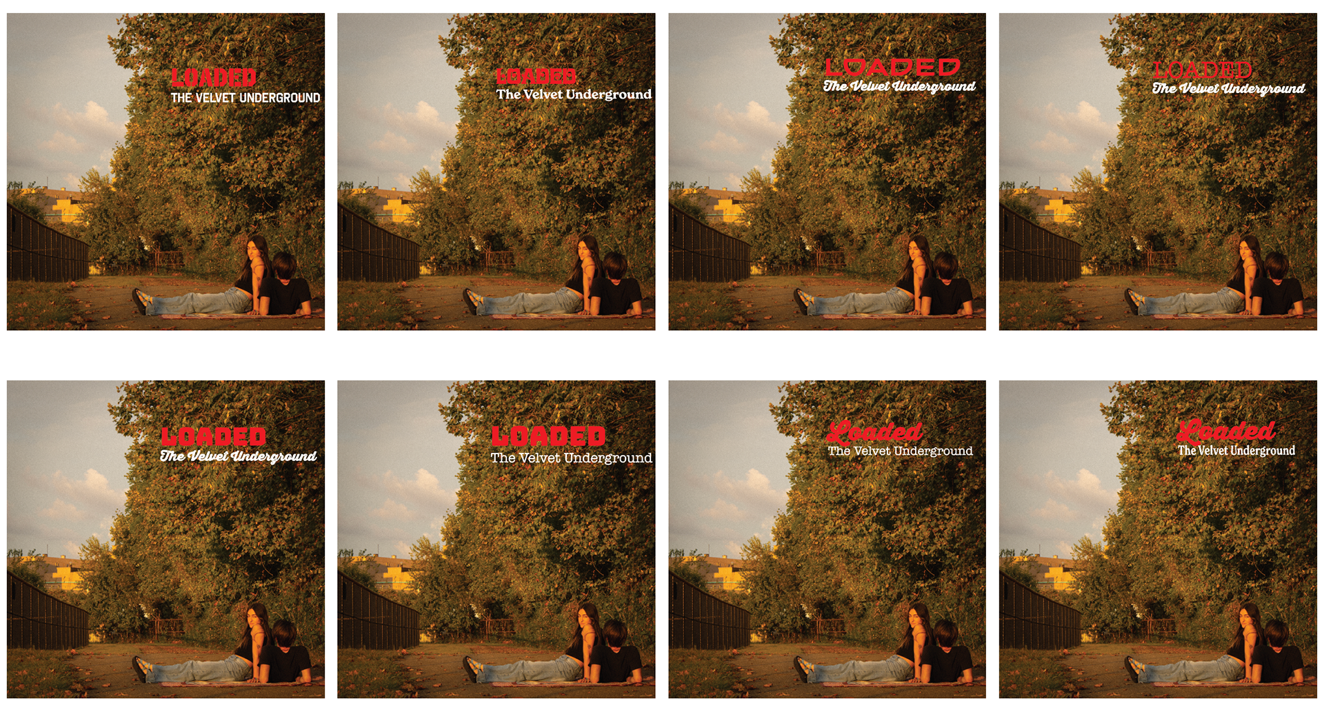
Typography was intended to reflect the era of the album, so typefaces with a vintage appearance were explored. The album is upbeat, groovy, and romantic, which are qualities held by the typeface I chose for the album name. The display type of the album name is red to communicate the themes of romance and existentialism that are posed in an ironic and bold manner. To further communicate the vintage feel of the album, a serif typeface with rounded qualities was selected to display "The Velvet Underground." White color is used for this type to contrast with the darker colors of the background and functionally communicate the band's name.
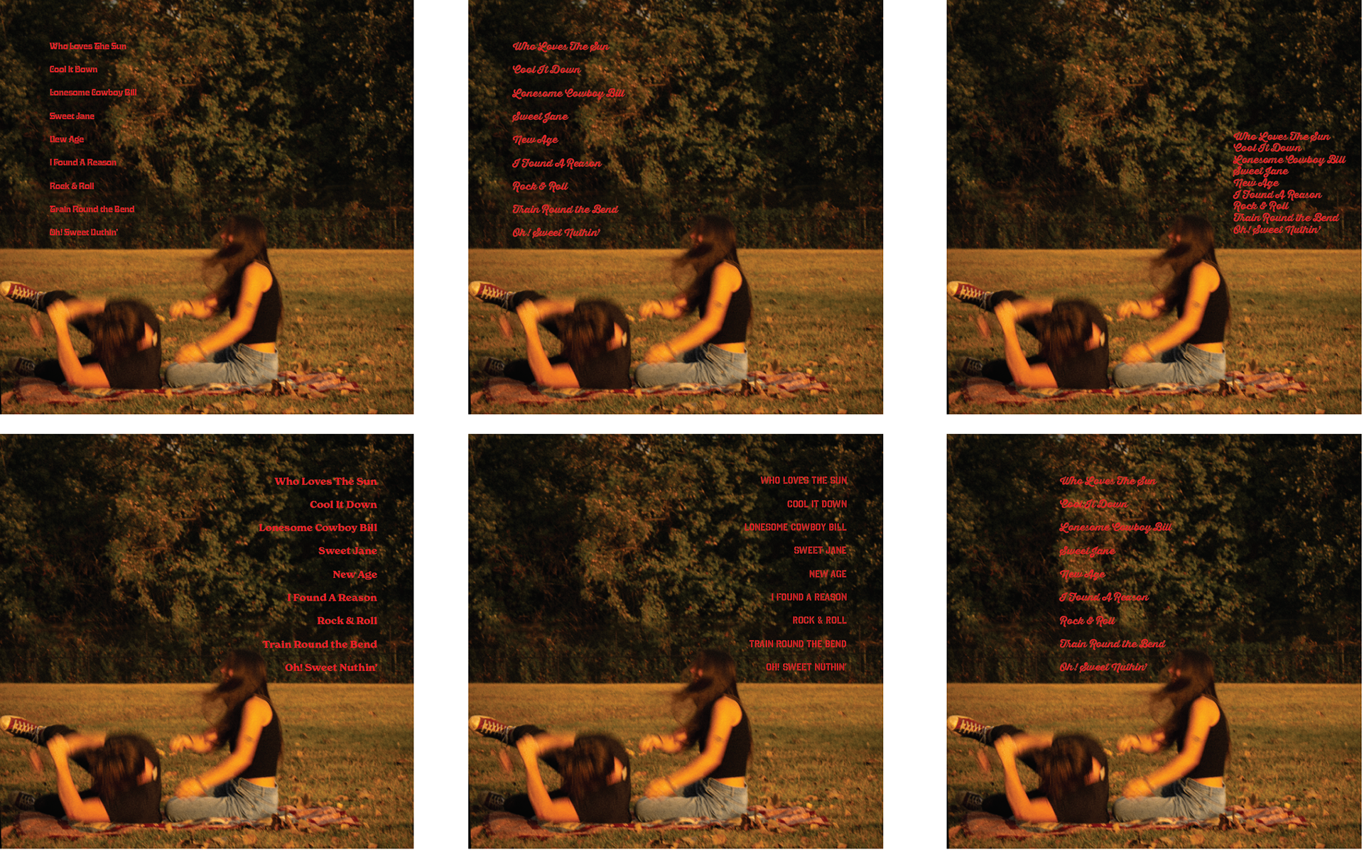
To establish a connection between the front and back cover, the display type of the album title is also used for the track list.
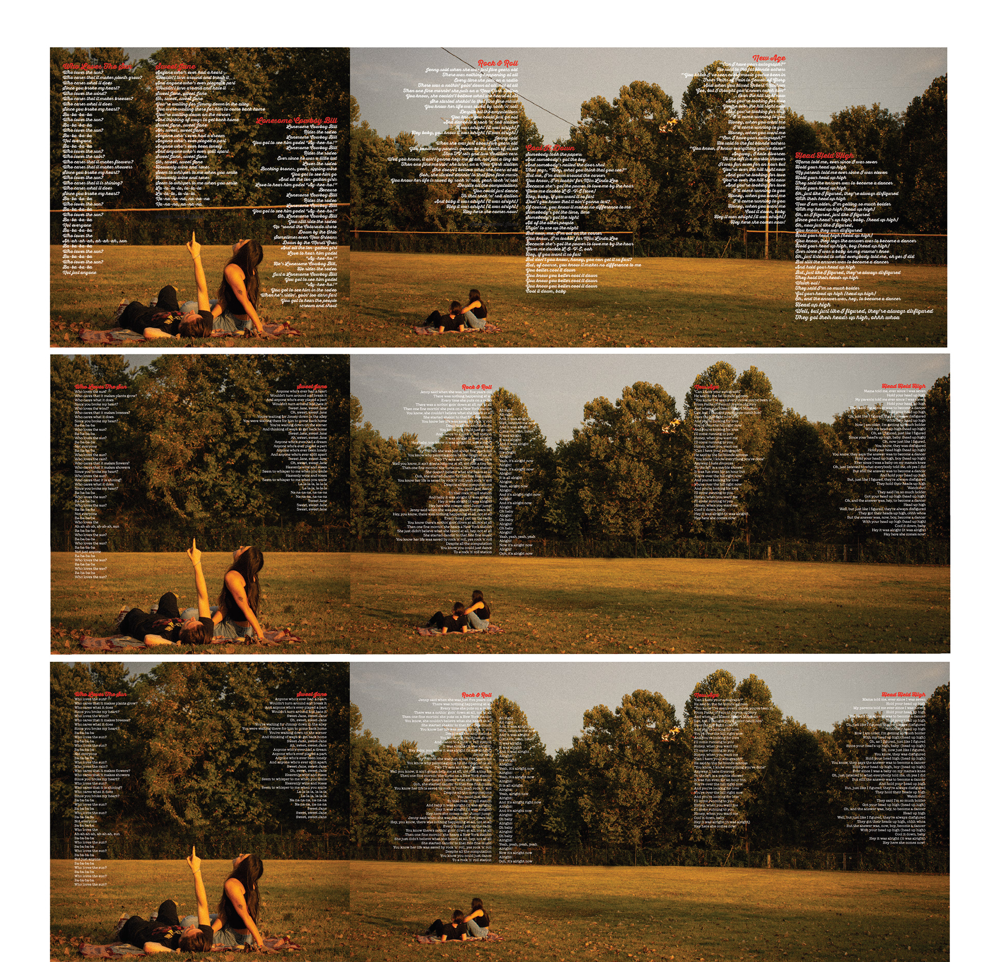
The typography of the lyrics is meant to draw little attention to itself while relating to the cover. I experimented with Thirsty Rough, which is the same typeface as the cover, along with New World, and American Typewriter. I ultimately selected American Typewriter, as this is a legible typeface at small sizes and reflects the intended vintage feel.
REFINEMENTS
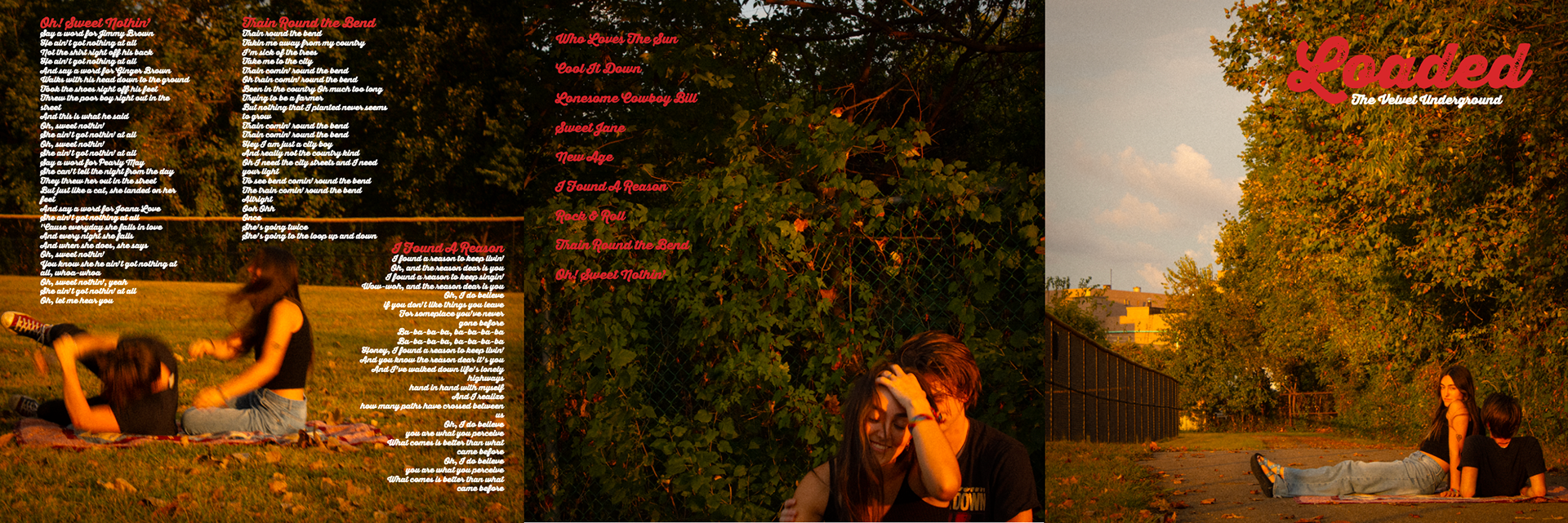
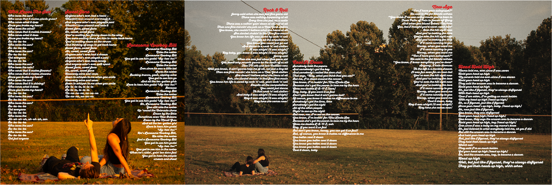
The initial CD design featured only one typeface, Thirsty Rough, which was used across the design. After exploring other type options and evaluating what each section of type was to communicate, New World was selected to display The Velvet Underground's name and American Typewriter was used to display lyrics. Lyric pages were refined to feature select songs from the album. The type size of lyrics was reduced. The placement of the lyrics was also refined, with the final design having consistent margins. Only six songs were chosen from the lyric book to allow for a better balance between type and photography. Photos were adjusted in photoshop to remove unnecessary elements, such as fences and light poles. Lastly, the back cover was changed to feature a close-up, low opacity photo of the couple looking at the sky. This change alludes to a photo featured in the lyric book spread while adding variation from the style of photography shown on the front cover.
FINAL